Re-branding a football club the size and prestige of Inter is a vast undertaking. How did you tackle such a brief, and where do you even start on something of this magnitude?
Borsche: FC Internazionale Milano approached us to discuss the evolution of their brand identity. Football clubs are now more active beyond the pitch and the world of football itself, and with this new activity, it is important to adapt and establish a competitive identity. For every football club, the crest is the holy grail adored by millions of fans around the world. So working on the crest was the starting point but also the most challenging part of the process.
What aspects were the most important to you to convey?
Borsche: The duality of the football club. It was important for us to convey Inter's strong history, social and cultural values while simultaneously communicating Inter as a contemporary global brand. Inter is a club known by many from different parts of the world. We wanted to create a look that would be accessible, sophisticated, relatable, and strong.
Football crests are a unique form of graphic design given the adoration and folklore surrounding them. Does that add pressure beyond other logo redesigns?
Borsche: Design is subjective, whether it is a football club, a fashion brand, or a program book for the opera. We approached this redesign with respect and admiration for all things FC Internazionale Milano. From the beginning onwards, we decided to keep the original crest's historic visual characteristics while concurrently making the shapes more simple.
Inter was established amongst a camaraderie between people of different backgrounds dating back to the club's formation. How important is this identity to you in your design?
Borsche: The duality of Internazionale and Milano was essential for the redesign. The club is proud of its Milano roots and its international fan culture. This pride is exemplified and amplified in the new crest. Internazionale I and Milano M are more prominent than ever before
There is a class and elegance about Inter that's renowned the world over. How does that character translate when working on something like a crest that embodies the whole club?
Borsche: We developed a system for all sectors of Inter. We created a crest referencing Giorgio Muggiani's original, which is accompanied by a new wordmark. The bold condensed logo has a strong appearance that compliments the crest and shapes the core elements of the visual identity. The task was to create something modern and elegant while maintaining a strong and sporty appearance
Inter's previous crest had beautifully composed and recognizable typography that dates back to 1908. How did you approach type in the redesign?
Borsche: The lettering and character composition were beautiful. At the same time, it was quite complex. The new crest focalizes on the I and the M. The I remains at the center of the crest. Though slightly modified, the M retains its unique overhanging arms. The symmetrical M remains behind the I. The circular foundation of the rings also remains intact. Overall the visual appearance of the new crest hints at the old one. The relation of space between letters and the whitespace in between remains almost the same (around 90%)
The blue, black, and gold of Inter are a defining aspect of the club's aesthetic. Was there space to experiment with the color palette of the previous crest at all?
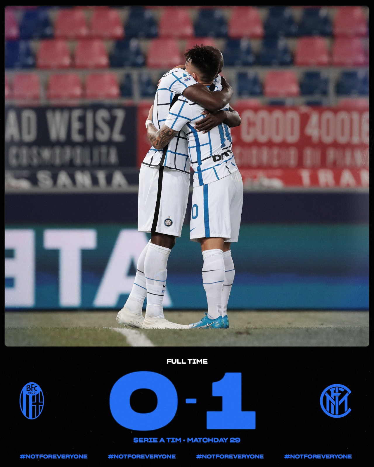
Borsche: The colors of the club were defined by Giorgio Muggiani in 1908, when he drew the original crest on the night of 9 March. Each color has a separate and specific significance. Ever since the club was founded, the Inter team has almost always worn black and blue stripes, earning them the nickname Nerazzurri. For the last 110 years, the Inter colors have only changed in gradation. We did the same. The blue is now more intense compared to the old azure. The new saturation brings a modern and digital touch. The same applies to the gold. It appears now as a vibrant and powerful color – similar to the gold used in the iconic '90s jerseys.
There's also the Biscione (snake emblem) that plays a central part in Inter's story. How did this come into the redesign?
Borsche: The Biscione is the heraldic and historical symbol for the city of Milano and is inseparably connected to the club of Inter. The Biscione even became the official logo for a short time in the late '70s. It is still part of the redesign- used as Biscione skin patterns, illustrations of different drawing styles, 3D renderings, and physical merchandise.
Football clubs have seen a massive shift in the way they communicate in recent years. How do you perceive Inter the brand vs. Inter the club?
Borsche: For Inter, and for European football in general, now is the time to introduce a new direction. It is time to face the challenges of our increasingly demanding world, both on and off the pitch and across the globe. For a football club to move beyond the stadium gates and weekly games, it needs to present itself as a global brand. To not only be present in society and in the world of sport but to emerge in the broader sphere of consumption (of goods and content), communication, and become a fully-fledged entertainment company. One hundred years ago, football clubs were able to communicate for only 90+ minutes on the pitch, and now it's 24/7 on social media. The consumption of content and the accompanying brand identity requirements have changed.
You have worked with a variety of clients in the fashion arena. What experience did you bring over to Inter from past more fashion-orientated clients?
Borsche: For the past five years, Nike has been one of our only long-term clients. We work with Nike's in-house designers on various campaigns and product launches in several different markets. Sometimes the focus is on sports and performance, but sometimes it is more targeted towards fashion clientele. This experience helped a lot! Though, of course, working for a football club with such strong history and enthusiastic fans is something special and super challenging! Most people are not big fans of change, especially when it comes to something their heart beats for. We approached the job with great dedication and understanding

 10 years of FIF
 Most Diverse Poster