New Inter Logo

Candreva Crosses

Allenatore
Allenatore
Joined
Feb 5, 2016
Messages
9,634
Likes
2,539
Favorite Player
Sheik Salman
Old username
EEeyOO
https://www.facebook.com/Inter/

On Facebook they are using gold rather than white, but there's no blue. Looks better (due to the blue outline of that story feature), but are they doing this on purpose?

Its because of the 4th shirt they will use today I think. On that shirt they use that emblem.
 
  • Like
Reactions: MVD

crzdcolombian

La Grande Inter
La Grande Inter
Joined
Aug 2, 2007
Messages
14,478
Likes
2,038
Favorite Player
Cryptozo d King
10 years of FIF
So we are going bankrupt... we are trying to sell the club

Hey let’s waste money on designers to make
Our logo uglier and then marketing to make people not say it’s uglier
 

Forzanerazzurri

Prima Squadra
Prima Squadra
Joined
Aug 10, 2015
Messages
911
Likes
554
Favorite Player
Real Ronaldo
So we are going bankrupt... we are trying to sell the club

Hey let’s waste money on designers to make
Our logo uglier and then marketing to make people not say it’s uglier

Huh? This is a troll account right?

- - - Updated - - -

Key takeaway: Most people are not big fans of change

:lol:

Give it another 6 months. Nobody will want the old one back.

- - - Updated - - -

This logo has grown on me already. In that ridiculous 4th jersey, with only yellow color (and black background) it looks really good.

Of course it is, and of course it does.

- - - Updated - - -

Frankly I think we should be happy. It is in the same style as our old logo. Juve have a FUCKING "Jj". All they had to do was a logo with a J and they still screwed it up and have 2 J's. We've got a logo that still looks similar to our original. Only real issue I see is the blue being the wrong shade. But that can be easily changed in the future

The blue is a more vibrant shade so it can be put on blue banners and really pop. Look at the logo on the blue background on the large adboard at the top of the sideline. It works so well there. The stadium looks great and actually looks like it has a team branded theme for once when all three of our ad boards are black and blue. Its brilliant branding and everyone on this forum is too dumb to see it.
 

Candreva Crosses

Allenatore
Allenatore
Joined
Feb 5, 2016
Messages
9,634
Likes
2,539
Favorite Player
Sheik Salman
Old username
EEeyOO
So we are going bankrupt... we are trying to sell the club

Hey let’s waste money on designers to make
Our logo uglier and then marketing to make people not say it’s uglier

I had the same idea as you about the economic situation and the logic of getting a new emblem but I don't think its that ugly as people make it out to be. Sure, the shade of blue is different and the FC part is gone too. Other than that it looks okay, not as good as the old one but still okey.
 
  • Like
Reactions: MVD

CafeCordoba

Moderator
Moderator
Joined
Mar 7, 2004
Messages
35,387
Likes
14,644
Favorite Player
Toro, Barella
10 years of FIF
This change, branding and logo and all is to make more money in the future. Being broken now has nothing to do with this change. This change has been probably planned long time ago, it being part of the long-term planning how to make Inter more attractive, more marketable.
 

brehme1989

La Grande Inter
La Grande Inter
Joined
Jan 17, 2005
Messages
34,500
Likes
17,178
10 years of FIF
Nostradamus
Most Passionate Member
This change, branding and logo and all is to make more money in the future. Being broken now has nothing to do with this change. This change has been probably planned long time ago, it being part of the long-term planning how to make Inter more attractive, more marketable.

That's not really a thing though. That's marketing hogwash. What was stopping us from making money with our existing logo or at least our existing crest and perhaps just slightly adjusting it. Barcelona and Real Madrid have had the same logo since forever and their last one came in the early 2000s. Long before they even decided to open up to the Asian and American markets and they barely changed anything in order to get more attenton.

Results give you this. Rebranding just puts you on the news when you're not relevant. If the aim is to stay irrelevant for years to come and Suning just wants to milk some cash, that's an even worse conclusion to reach than the fact that this was just a silly mistake.
 

YoramG

Allenatore
Allenatore
Joined
May 19, 2013
Messages
7,535
Likes
7,615
Favorite Player
Zanetti
10 years of FIF
Man...I don't know if you guys have seen the Nike trainers we've put out as part of this marketing push, but I'd buy 10 if they were actually put on sale. They look so, so clean.
 

ElDuccio

La Grande Inter
La Grande Inter
Joined
Mar 10, 2013
Messages
11,835
Likes
3,109
Favorite Player
Il Fenomeno
10 years of FIF
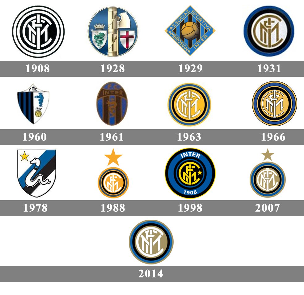
history-Internazionale-Logo.jpg

Looking back, I don't think our new logo is the worst of our logos we have had.
I would rate the snake logo during 1978-1988 as the worst because it looks like snake drawing at the cheap snake & ladder boardgame. The 1988 logo also was horrible with the dominance of yellowish/goldish color.
IMO our previous logo was the best we have had so any change would likely lead to downgrade. I don't think the new logo is as bad as people perceive to be. It is fairly good. It is just people hate change but soon people will get used to it. I only wish they do not drop our traditional gold color entirely.

the one from 1961 was also terrible..looks like the old Juve logo with Inter colors. 1960 looks like a logo for some marine company :lol:

for me the best will remain the one from 2007 and 1998. The one from 2014 was ok, but nothing special.
 

CafeCordoba

Moderator
Moderator
Joined
Mar 7, 2004
Messages
35,387
Likes
14,644
Favorite Player
Toro, Barella
10 years of FIF
That's not really a thing though. That's marketing hogwash. What was stopping us from making money with our existing logo or at least our existing crest and perhaps just slightly adjusting it. Barcelona and Real Madrid have had the same logo since forever and their last one came in the early 2000s. Long before they even decided to open up to the Asian and American markets and they barely changed anything in order to get more attenton.

Results give you this. Rebranding just puts you on the news when you're not relevant. If the aim is to stay irrelevant for years to come and Suning just wants to milk some cash, that's an even worse conclusion to reach than the fact that this was just a silly mistake.

You said it yourself. Barcelona and Real were able to make it because they were so good from mid-2000 onwards and Ronaldo-Messi placed them all over the globe. We need to do something else because it would take years and years to build same kind of hype. AND still we probabl couldn't do it because we don't have the money to buy superstars and it's almost impossible to find messis or ronaldos these day in young age.

Of course this branding is a short-route and not with the same effect, not anywhere close, but it's a start. Like explained by Inter, this is to have the logo better for small screens (young people with phones everywhere) and also it being simple to be able to place it more easier anywhere like clothes.

We cannot do same stuff as others have done. World is changing fast and we need to keep up. There have been a lot of marketing people doing this shit so I wouldn't bash it (rebranding) the moment I see it like you seem to do. You can call it a mistake, but so what? The purpose of this is to make more money for the club so we need to see how this pans out. Sentimental aspects need to be set aside unfortunately in todays football.
 

brehme1989

La Grande Inter
La Grande Inter
Joined
Jan 17, 2005
Messages
34,500
Likes
17,178
10 years of FIF
Nostradamus
Most Passionate Member
But that's nonsense really. The logo does not add value, it's just adds irritation to the fanbase. The logo is meant to mean something to the club and have relevance to its identity and history.

Manchester freaking United is the most money-grabbing marketing organzation in the sport, and they have not changed their logo since 1998, which was just a repainting with a more intense red from their symbol that's there since the 70s. They literally just made the red more intense, nothing different. So did Barcelona and Real Madrid, just cosmetic changes. Arsenal kinda switched the cannon the other way and Chelsea just put their logo in a circle. Similar to what Milan had done 10-20 years prior.
Honestly, if this was a money grabbing opportunity, Manchester United would have changed logos at least twice since Glazer took over. But they hadn't even considered doing it. If there's someone who knows sports economics in football, it's those guys.


Only Juventus did this bullshit and we're following them straight to the iceberg. It adds no value and it makes no sense. There's no brand value in changing your highly recognizable logo into something that's not.

This is just confusing, we're not in the NBA to change names and logos and "rebrand" as if we're looking for different fans in our new location/market.

The logo is better for small screens, come on man :lol: :lol: :lol: Just reset the existing one with a few minor touches... That's a horseshit argument and you know it :lol: :lol:

World is changing, but I don't see any logos changing, and if they do, it's not to something absurd, unless you're referring to Juventus' toilet.
 

CafeCordoba

Moderator
Moderator
Joined
Mar 7, 2004
Messages
35,387
Likes
14,644
Favorite Player
Toro, Barella
10 years of FIF
It adds irritation to you and some people here. Pretty sure big portion of Inter fanbase are just fine with the logo next season already.

Manchester United is another example of Barcelona/Real. United was the first mover in the globalized football business, there wasn't similar competition back then. We are way too late in the party, to mimic those ones. That's why we did things differently.

You say it adds no value, but who are you to judge it? It's easy to throw "hahaha it doesn't add any value (because I don't like it)", but there's nothing to back that apart from your own opinion. Maybe the market people in this rebranding operation thinks otherwise?
 

brehme1989

La Grande Inter
La Grande Inter
Joined
Jan 17, 2005
Messages
34,500
Likes
17,178
10 years of FIF
Nostradamus
Most Passionate Member
It does not add value because that is embedded to the team's success. Please do come up with the list of benefits from this change and show us the benefits other clubs witnessed from a radical change.

As I said, if the aim is to sell stupid t-shirts to Asia and the USA, ignoring the core fanbase, then sure, it may work for a bit to sell random apparel. Some kids will think this is a cool Transformers or Volkswagen logo and cry until their parents pick one up.


But there is no point in doing this. Juventus gained NOTHING from changing their logo, yet at least they did manage to incorporate that toilet seat figurine into their jersey, so there's that. They're trying to do what teams like Inter, Milan, Barcelona, River Plate, Boca Juniors etc have had. An identity. We're black & blue stripes for example. Everyone sees black & blue stripes and immediately they think of Inter. They see Atalanta, and they assume they copied Inter. They see Club Brugge, and they assumed they copied Inter. Sure, Juventus was black & white stripes for years, but they've decided to abandon that. What did it get them? Backlash and ridicule. So they went back to that. And the logo? Well, they barely made it past the round of 16 after launching it, yet in their last season with their old one they reached CL final :D

Want to take a quick guess when Juventus will probably return to their old logo? I say it's in this decade.

With both our stupid change and Juventus' change, all you can see is an attempt to sell apparel. You could simply launch a promotion for that, no need to change the club's crest, something that is sacred and historic. Even freaking Arsenal when they modernized their logo in the 90s, all they did was flourish the colors a bit and make the cannon point to the other direction, as if it was pointing forward rather than backwards now, some sort of 'to the future' concept which for years their fans didn't even understand, so they added a "forward" label underneath :lol: Doing that, they butchered their historic Latin phrase, but it's Arsenal, who cares?

There just does not seem to be any benefit to radically change your historic logo. And if you want a change, at least write INTER at the bottom or top so people will know what the fuck this crest represents, because it's not really clear and it's not representative of the club. The gobbi for example know how ridiculous their concept is, so they had to add the team's name there also! Maybe if no one bothers to change it, 50 years from now it will give Inter vibes, but today, it does not.

FIF reaction to Juventus logo change: http://forzainterforums.com/showthread.php?41-Vaffanculo-Juve!!!&p=1573528&viewfull=1#post1573528
 

TheNetworkZ

Allenatore
Allenatore
Joined
Mar 13, 2012
Messages
8,472
Likes
2,548
Favorite Player
The Bro
10 years of FIF
Brehme bro its time to let juventus out of your head, or at least charge them rent.

Sent from my SM-G973W using Tapatalk
 

Candreva Crosses

Allenatore
Allenatore
Joined
Feb 5, 2016
Messages
9,634
Likes
2,539
Favorite Player
Sheik Salman
Old username
EEeyOO
Man...I don't know if you guys have seen the Nike trainers we've put out as part of this marketing push, but I'd buy 10 if they were actually put on sale. They look so, so clean.

Same, fucking bastards.
 
  • Like
Reactions: MVD

William

Allenatore
Allenatore
Joined
Jun 18, 2010
Messages
5,387
Likes
906
Favorite Player
Zanetti
Forum Supporter
10 years of FIF
It’s kind of amusing but, the one item we’d be willing to buy they aren’t willing to sell!

I M needing new trainers!!
 

Universe

Moderator
Moderator
Joined
Jan 27, 2009
Messages
28,713
Likes
14,436
Forum Supporter
10 years of FIF
FIF Special Ones
Most Humorous Member
Man...I don't know if you guys have seen the Nike trainers we've put out as part of this marketing push, but I'd buy 10 if they were actually put on sale. They look so, so clean.

you mean those black and blue snakeskin shoes?
 

vasilios

Administrator
Administrator
Joined
Nov 5, 2009
Messages
8,591
Likes
2,796
Favorite Player
Il Chino
Forum Supporter
10 years of FIF
you mean those black and blue snakeskin shoes?

Yep, the AF1's. There's a white/blue pair as well, but they're both only available via the inter.it raffle thing. Meanwhile, you can buy dozens of dog shit t-shirts and sweatshirts with ridiculous I M nonsense plastered all over the back.
 
  • Like
Reactions: MVD

qb4ever_2k

Allenatore
Allenatore
Joined
Sep 6, 2011
Messages
6,211
Likes
3,217
10 years of FIF
Man...I don't know if you guys have seen the Nike trainers we've put out as part of this marketing push, but I'd buy 10 if they were actually put on sale. They look so, so clean.

Honestly, I much prefer the royal blue Air Jordan 1s.

But they are equally hard to buy :yao:
 

Aries

Primavera
Primavera
Joined
Apr 14, 2010
Messages
414
Likes
95
Favorite Player
Zanetti
The owner of the company that designed the new Inter logo gave an interview about it.


https://www.highsnobiety.com/p/inter-milan-new-logo-bureau-borsche/

Thanks for sharing this

More telling than the interview I think is all the different designs they had in those photos.

I think it definitely shows that their intent was to find a way to simplify the logo as a means to make it more marketable. Whether changing the club crest is an effective way to make that happen I agree, is debatable. (like what's been said, Real Madrid, Barcelona, Man Utd all have rich, historic crests).

Honestly though...this club nailed it with that original 1908 logo. Nothing can beat it in terms of class and making all the elements work together.
 

Nero Indigo

Capitano
Capitano
Joined
May 21, 2009
Messages
4,681
Likes
614
Favorite Player
Vieri*
Forum Supporter
10 years of FIF
Honestly, I much prefer the royal blue Air Jordan 1s.

But they are equally hard to buy :yao:

There were a pair of limited edition Puma States lows (with the black classic fat chunky laces) that I bought, designed by Model/DJ Vashtie a couple of years ago. It was jet black with navy blue stripes, the shade of navy was awesome because from a distance you can see it blends well with the black. Immediately you look at it the first thing that comes to your mind is Inter :lol: and I’m also a fan of Puma lows so I had to have it.
 
Top